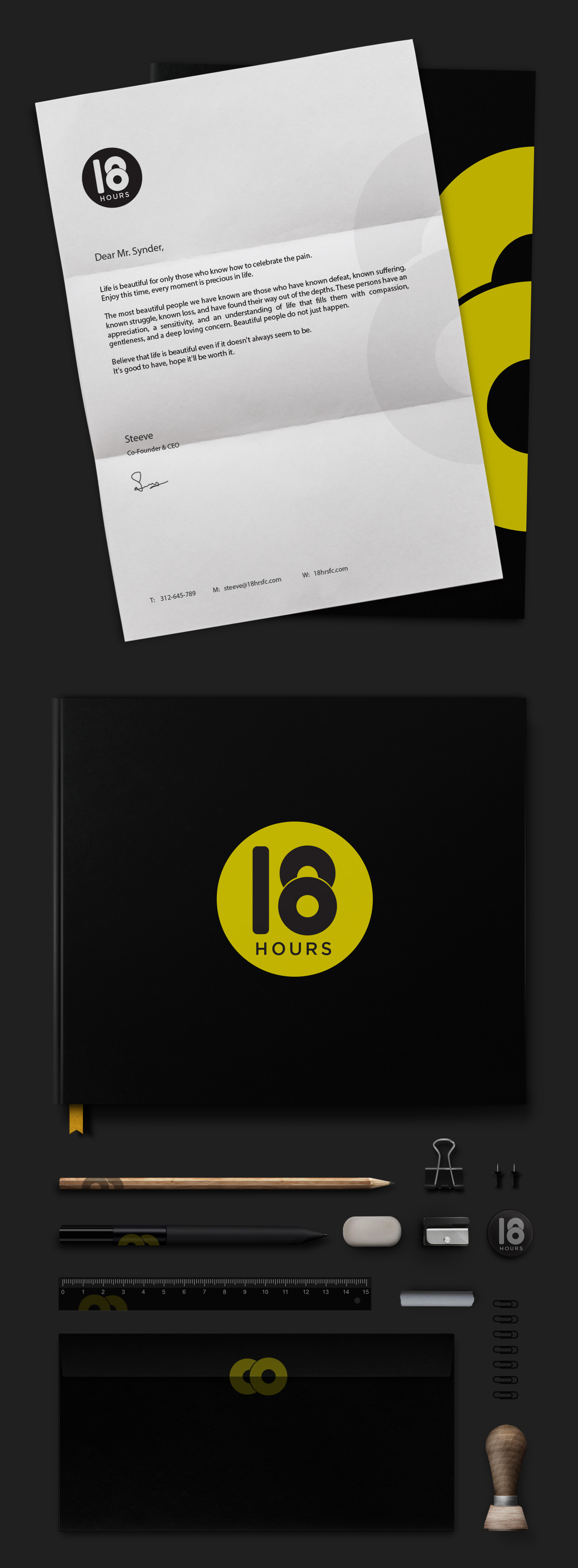
Developed the 18 Hours brand identity around the idea of strength, discipline, and everyday fitness. The logo concept was explored through hand sketches and geometric forms, drawing inspiration from gym equipment such as weight plates, dumbbells, and pull-up bars.
The final mark combines the number “18” with a bold circular structure to create a simple, strong, and recognizable identity that can work across different brand applications.
The final mark combines the number “18” with a bold circular structure to create a simple, strong, and recognizable identity that can work across different brand applications.